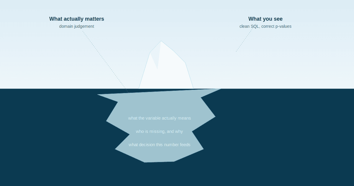
None of them are calculation mistakes. That is what makes them dangerous.
When someone sends me their data for analysis, they usually expect the problems to be statistical. Wrong test, wrong assumption, something in the maths.
It is almost never that.
Across more than twenty postgraduate health studies, the same five errors keep arriving. Every one of them survives a code review. Every one produces output that looks entirely reasonable. And every one is the kind of thing a panel finds in the first four minutes, because examiners have seen it before too.
I am writing them out plainly because most of them are avoidable at the design stage, which is to say months before anyone runs a test. If you are analysing your own study, or someone else's, this is the list I would check first.
1. The denominator does not match the numerator
The most common serious error in health analysis, and it almost never announces itself.
A rate is two numbers. People check the top one carefully and assume the bottom one.
How it shows up:
Immunisation coverage above 100 percent. Doses given at the facility divided by the facility's catchment population. But children are brought in from outside the catchment, so the numerator counts a wider group than the denominator describes.
Treatment default rates that look implausibly low. Defaults in the last quarter divided by everyone ever enrolled. The numerator covers three months, the denominator covers five years.
Bed occupancy calculated against total beds rather than total available bed days, so a ward that closed for two weeks looks quietly efficient.
The catch:
Write out, in a full sentence, who is in the numerator and who is in the denominator. Then ask two questions. Is every person in the numerator also in the denominator? Does the denominator contain anyone the numerator could never include?
Thirty seconds. It catches errors that survive peer review.
1. The denominator does not match the numerator
The most common serious error in health analysis, and it almost never announces itself.
A rate is two numbers. People check the top one carefully and assume the bottom one.
How it shows up:
Immunisation coverage above 100 percent. Doses given at the facility divided by the facility's catchment population. But children are brought in from outside the catchment, so the numerator counts a wider group than the denominator describes.
Treatment default rates that look implausibly low. Defaults in the last quarter divided by everyone ever enrolled. The numerator covers three months, the denominator covers five years.
Bed occupancy calculated against total beds rather than total available bed days, so a ward that closed for two weeks looks quietly efficient.
The catch:
Write out, in a full sentence, who is in the numerator and who is in the denominator. Then ask two questions. Is every person in the numerator also in the denominator? Does the denominator contain anyone the numerator could never include?
Thirty seconds. It catches errors that survive peer review.
2. Comparing populations that are not comparable
Two facilities, two departments, two states, two time periods. The same calculation applied to both, and a conclusion drawn from the difference.
How it shows up:
Mortality compared between a tertiary referral centre and a district hospital. The referral centre receives the sickest patients by design. Its higher rate is evidence the referral pathway is working, not evidence of poor care.
Crude death rates compared between two communities with different age structures. The older population will show a higher rate almost regardless of health service quality, which is what age standardisation exists to correct.
Length of stay compared across departments where the case mix is entirely different.
Outcomes compared before and after an intervention, where the case definition also changed partway through.
Why it persists:
The calculation is identical in both groups, which makes it feel fair. Fairness in the arithmetic is not fairness in the comparison.
The catch:
Before comparing any rate across groups, ask whether the two denominators contain comparable people. In health they usually do not. If they do not, you need stratification, standardisation, or an explicit caveat sitting next to the number rather than buried in the limitations.
3. Treating missing data as an inconvenience rather than a finding
The default instinct is to make missingness go away. Drop the rows, impute the mean, move on.
In health data this is frequently the moment the study breaks.
How it shows up:
A lab value missing for 60 percent of patients. Imputed with the column mean. But the test was ordered for the patients clinicians were worried about, so the missingness is clinical information and the imputation erases it.
Follow up data with 30 percent loss. Analysed as though the remaining 70 percent represent everyone. The people who dropped out usually dropped out for reasons connected to the outcome being measured.
Age recorded as zero in a maternal and child health register. Flagged as invalid and removed, taking every neonate out of a study about mothers and newborns.
Blank discharge dates filled with a default that quietly inflates average length of stay.
The principle:
Missingness in health records is essentially never random. Someone decided not to order the test, the patient decided not to return, the clerk decided the box did not apply. Each of those decisions carries information.
The catch:
Before handling missing values, find out who is missing and why. Then say so in your write up. "Data were missing for 60 percent of patients, and testing was clinician initiated, so absence likely indicates lower clinical suspicion" is a finding. Silent imputation is a problem waiting for an examiner.
4. Reporting significance without magnitude
A p value tells you whether a difference is likely to be real. It tells you nothing about whether it matters.
How it shows up:
A statistically significant difference in length of stay between two wards. The difference is 0.2 days, roughly five hours, in a sample of four thousand. Real, and almost certainly not worth restructuring anything for.
A significant association reported with no effect size, so the reader cannot tell whether the relationship is strong or barely detectable.
The reverse error, which is just as common: a clinically meaningful difference dismissed because p was 0.08 in a sample too small to detect it.
Recommendations built on statistical significance alone, with no discussion of whether the size of the effect justifies the action.
The principle:
Large samples make small differences significant. Small samples hide large ones. Significance is a statement about evidence, not about importance.
The catch:
Report the effect size alongside every p value, and add one sentence saying whether it is large enough to act on. If you cannot write that sentence, you have not finished interpreting the result.
5. Claiming a relationship the design cannot support
The last error, the most consequential, and the one that most often turns a good defence bad.
How it shows up:
A cross sectional survey used to claim that one thing causes another. Cross sectional data captures a single moment, so it cannot establish which came first, let alone what drove what.
Facilities that run more staff training showing higher infection rates, reported as evidence that training is ineffective. Larger, busier facilities do more of both. Size drives both sides of the relationship.
Improvement after an intervention attributed to the intervention, with no control, no baseline trend, and no consideration of what else changed in the same period.
Recommendations phrased as "X should be increased in order to reduce Y", from a study that only ever showed X and Y move together.
Why it persists:
Because the finding is genuinely interesting, and causal language is more satisfying to write. "Associated with" feels like hedging. It is not hedging. It is accuracy.
The catch:
Before writing a conclusion, name one variable that could plausibly produce both sides of the relationship, and check it. Then check whether your design can establish sequence at all. If it cannot, say "associated with" and mean it.
What these five have in common
None of them is a mistake in the arithmetic. Every one is a mistake in the reasoning surrounding the arithmetic.
That is why they survive so long. Statistical software will not object. A code review will not catch them. They pass every automated check available, and then someone who knows the setting asks one question and the finding falls over.
Four of the five are also cheapest to fix before any data is collected. Denominator definition, comparability, missingness, and whether the design can answer the question are all design decisions. By the time you are running a test, you are living with choices that were made months earlier.
Which is the strongest argument I know for involving someone analytical at the design stage rather than at the analysis stage, and the reason so much of what I do is fixing things that were decided before I was asked.
A short checklist
Run this against any analysis, yours or someone else's:
Write the numerator and denominator as full sentences. Do they describe the same population?
If you are comparing groups, are the groups comparable? If not, what are you doing about it?
Who is missing from this data, and why? Does the reason relate to what you are measuring?
What is the effect size, and is it large enough to act on?
Can this design establish what you are about to claim? Name one alternative explanation and check it.
Fifteen minutes. It will not make your analysis better. It will tell you where it is weak, which is more useful, and it is the difference between finding out yourself and finding out in a room full of examiners.
Not sure where your own weak link is? I built a short diagnostic that scores three capabilities separately, technical execution, domain judgement, and analytical reasoning, and tells you which one is limiting the other two. Eight minutes, free: Healthcare Data Analyst Readiness Assessment